If you have ever said something carelessly then you have probably been told that “you can catch more flies with honey than vinegar”. This piece of practical wisdom reminds us to think about what we say and how we say it. A single thought can be presented many ways with very different reactions and consequences. Good ideas can be ignored because of poor presentation and bad ideas can get attention simply because of a dynamic presentation (think pyramid schemes or late-night infomercials).
In his book “How to Lie with Statistics“, Darrell Huff provides some great examples of how seemingly good presentations of statistics can fool readers or exaggerate weak findings (bad idea). In each of these examples, the “lying” either creates or takes advantage of a disconnect between statistics and their perceived meaning. It is important to keep in mind that not every statistical lie is intentional or malicious. In many cases it is a result of oversight, a lack of consideration or having enough time to adequately reflect on the content. In other cases it is a result of a series of bad choices in how to visually represent the data.
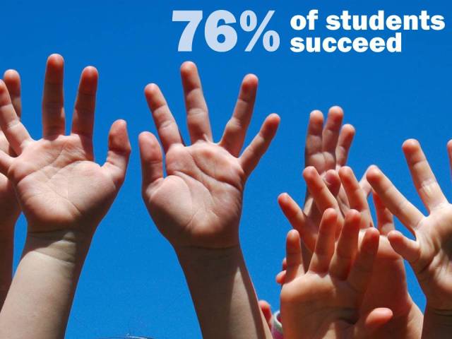
Each year in Ontario the Education Quality and Accountability Office (EQAO) administers assessments to students in grades 3, 6, 9 and 10. In the early 2000’s a target was set by the Ontario Ministry of Education with the goal of 75 per cent of students in grade 6 expected to meet or exceed the provincial standards. With this target in mind, consider the message and meaning conveyed by following images.

This is great news! The text indicates that the target set by the Ministry of Education has been met. However, this first picture doesn’t look or feel celebratory. It doesn’t leave you with the feeling “We are doing great! We have met and exceeded the provincial target!”. Instead, the text appears to be sliding off the page, the percentage is an unpleasant color (in fact the only color in the picture) and the child sits on the dark side of the image with only his frustration and incomplete work illuminated. This picture suggests that 76% isn’t enough even if it is better than the provincial target. It seems to ask “What about the other 24%?”

How about this second picture? The sky is clear and blue, hands are lifted and seem to be pointing to a number that floats high in the air. This image supports and reinforces the message that 76% should be celebrated. That it is an achievable goal.
Although these pictures have the same message (76% of students are successful) and use the same font to convey that message, the images, colors and orientations deliver very different meanings. Researchers may not deal with photographs or advertising messages but we do develop visualizations of data. Unfortunately, a great deal of the way data is presented in research is determined by software default settings. The worst of the offenders are the plots that take advantage of pretty features (think sparkly, shiny 3D Excel pie charts).
Many things can be learned from advertising which uses novelty and humour to catch peoples’ attention and stake a claim in peoples’ memory. I am not suggesting that we start embedding jokes and punch lines into reports. However, I am suggesting that introducing elements of novelty could do much of the heavy lifting when it comes to attracting, engaging and being memorable in the minds of stakeholders.
Most of the ways we graphically present data (bar charts, line charts, pie charts) were developed in the 1800’s and remain largely unchanged. It is time for Education Research to better leverage the computing and graphical power we have access to. What would education data look like using visual modelling from the field of genetics? How do engineers visualize processes and could they be adapted to describing how students move through our systems and institutions? With a greater capacity to process and graphically present data we need to make sure that we consider the messages that are being conveyed not only in our written text but also in our data visualizations.
In upcoming posts I will explore these considerations and provide examples using publicly avaiable data from education organizations/institutions in Ontario.

Effective and thought provoking Chris.