
Both Education and Health Care are complex systems that impact everyone. Those who work in both of these systems dedicate a great deal of time to collect data to inform and support decision making. Unfortunately, data from a complex system is complex. Even more unfortunately, the easiest questions to ask are usually the hardest to address through data analysis. Are our schools better? Are people healthier? Not to sound evasive but it depends on what you mean by “better” and “healthier”. “Better” to the parent of a kindergarten student may relate to how welcoming they feel the school is, how quickly their child’s reading skills develop and how much their child enjoys going to school. For the parent of a high school student it may be how well prepared they feel their child is to graduate or how well positioned they are for a job, College or University. Patients in emergency rooms will probably focus on the length of time it takes to see a physician while someone with questionable test results may reflect on how long it takes to see a specialist to determine whether something is wrong.
To understand these complex systems Leaders in these organizations rely upon a variety of indicators (data that provides feedback on the status or condition of an organization). At the Ministry of Education indicators are used to monitor and evaluate areas such as literacy, numeracy and student achievement. While these indicators summarize very large data sets, they are seldom abstract enough for relationships and patterns to be easily discernible. If, on average, we can only retain 7 to 9 chunks of information, it becomes an almost impossible task to perceive trends across 20 graphs of indicators which each contain 20 points of comparison. Clearly more consideration and work is required.
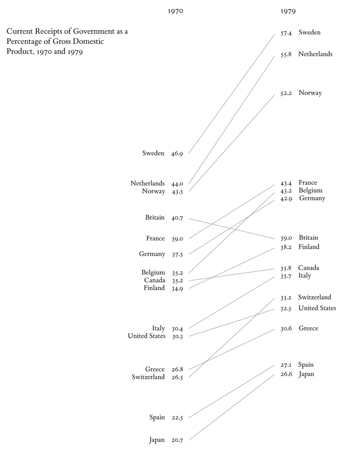
Last week I came across this post from Charlie Parks who highlighted the slopegraph; an infrequently used data visualization first proposed by Edward Tufte. To draw attention to the value of slopegraphs and encourage their use, Charlie reviewed some examples and invited people to forward more. His post was very persuasive and motivated me to look for a data set and explore how slopegraphs might be applied.
 While researching the availability of community data sets I found a 2011 Report on Ontario’s Health System called the “Quality Monitor: Health Quality Ontario” (English report here and Regional analysis here). This report was a collaboration between Health Quality Ontario and the Institute for Clinical Evaluative Sciences (ICES). The analysis included in this report is exhaustive and profiles 14 Local Health Integration Networks (LHIN) but does not provide the kind of higher level summary that slopegraphs could provide. After looking more closely at the data I realized that it would not be possible to create a slopegraph according to Tufte’s strict definition which requires a univariate timeseries for multiple categories or groups. Unfortunately, there are no historical data sets included in the Health data report. Nevertheless, I think that the slopegraph could be just as meaningfully adapted to aggregated categorical data where there are explicit relationships between the categorical variables and a common scale. I also think the slopegraph would be more widely adopted if its definition was expanded to include other data types.
Caveat…
To that end, while I recognize the following graph is a modified slopegraph (or a parallel coordinate plot), I will refer to it as a “slopegraph” for ease of reference.
A little bit about the data…
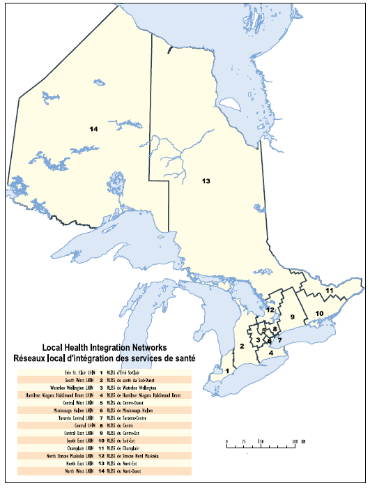
 The 2011 report from ICES addresses the complexity of the Health Care System by reducing it to 121 indicators which are reported for each of the 14 LHINs (the map of LHINs on the right can be found on page 119 of the report). Each of the 1,694 cells in the data table (pages 129 to 136 of the report) has been color coded to make it easier to perceive meaningful differences:
- Light-Blue = LHIN-values that are higher than the provincial-values.
- Light-Orange = LHIN-values that are lower than provincial-values.
- White = LHIN-values that are equivalent to provincial-values.
It is important to note that the criteria ICES uses for these comparisons vary according to the distribution of values and the direction of the indicators (see foot note on page118). After a little data-entry, the following totals were calculated:
- Total number of LHINs that are “Above Average” for each indicator.
- Total number of LHINs that are “Below Average” for each indicator.
- Total number of Indicators that are “Above Average” for each LHIN.
- Total number of Indicators that are “Below Average” for each LHIN.
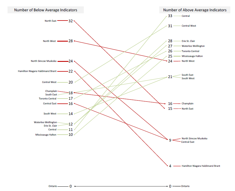
Using these summaries, a slopegraph was created to explore the differences between LHINs.
Reading a slopegraph…
As mentioned previously if this slopegraph conformed rigidly to Tufte’s definition, each the line connecting each vertical axis would describe change over time. Instead, this slopegraph describes the difference between LHINs on two measures: the number of “Below Average” indicators and “Above Average” indicators. Each measure is given its own axis which begins at 0 (bottom) and ends at 33 (top). Although each axis uses the same scale the only labels that are included are those that represent LHIN-values. For example, on the “Below Average” axis the Central East LHIN (this network includes the Durham Region) has a value of 16 (16 “Below Average” indicators in the Central East LHIN). Since there is no LHIN that has a “Below Average” value of 15 (15 “Below Average” indicators), there are no labels or values printed at this position. An advantage of this approach is how easy it becomes to see the distribution of values, th maximum and minimum values and how the data may be grouping or clustering across each distribution.
Two additional modifications to the slopegraph include the labelling of repeating values and the color coding of slopes. In Tufte’s example of a slopegraph, repeated values were stacked (for example the position of Canada and Belgium in 1970). However, by stacking the labels it gives the visual impression that one label is higher than the other. To address this I added tails to connect each label to its value on the axis. Where there are repeated values, the tails are diagonal and where there are single values, the tails are horizontal. One issue to consider regarding this modification is whether the tails add too much visual clutter or if (as intended) it makes it easier to distinguish the position of the labels relative to their values.
The line that connects the LHIN-values on each axis has been color coded to highlight the direction of the slope. Lines that increase from left-to-right represent LHINs that have more “Above Average” indicators than “Below Average”. To highlight this positive slope the line has been shaded green. On the other hand, lines that decrease from left-to-right represent LHINs that have more “Below Average” indicators than “Above Average” and have been drawn in red. Since provincial values were used to determine whether indicators are above or below average, the province has been included to anchor the graph and serve as a visual point of reference for the other values.

Of all the interesting patterns and differences that emerged from this data set, the one that caught my attention was the location of the slope for the Central East LHIN. If you were asked to find a LHIN that is most representative of the province (fewest “Above Average” indicators and fewest “Below Average” indicators), Central East would be the line to choose. While other LHINs have smaller values on one axis, there are no others that have values that are as small on both measures. For example, although the Hamilton Niagara Haldimand Brant LHIN has fewer “Above Average” indicators (4) it has significantly more indicators that are “Below Average” (22).
To find that the Central East LHIN is closest to the provincial slope is not surprising. The Durham Region regularly mirrors provincial averages and change over time for a wide variety of indicators from other sectors. In fact, the Durham Region is very similar in terms of geography where the south very urban and the north is rural. This geographic distribution also translates into similar socio-demographic distributions. For those market researchers out there, all roads may lead to Rome but all data sets appear to lead to the Durham Region as an incredibly consistent provincial microcosm.
Final thoughts on slopegraphs…
Rather than restricting slopegraphs to univariate timeseries data, I think it should be more generally defined by its key characteristics such axiis with common scales, explicit relationships between the plotted variables and minimal data-ink. However, if this is taking too much license with the definition of a slopegraph perhaps there could be a taxonomy of slopegraphs with this one classified as a Categorical-Slopegraph?
Additional trivia from the data set…
Each of the indicators that were included in the ICES analysis could be further aggregated into one of 18 groups. However, there is little consistency in the number of indicators that comprise each group. For example:
- “Accessible 2.3 Surgical Wait Times and Access to Specialists” is comprised of 24 indicators.
- “Integrated 8.1 Discharge/ transitions” is comprised of 20 indicators.
- “Safe 4.3 Mortality in hospital” is comprised of 1 indicator.
- “Accessible 2.2 Access to Primary Care” is comprised of 2 indicators.
There were very few instances of missing data (No Value) but data for two indicators was missing for the majority of LHINs:
- “Accessible 2.3 Surgical Wait Times and Access to Specialists – knee replacements” (No Value for 11 of 14 LHINs)
- “Accessible 2.3 Surgical Wait Times and Access to Specialists – Cataract surgeries” (No Value for 9 of 14 LHINs)
Proportionally, the indicator groups with the highest (most “Above Average” indicators) and lowest (most “Below Average Indicators”) percentages for the province were:
- Above Average: Accessible 2.3 Surgical Wait Times and Access to Specialists
- Below Average: Safe 4.3 Mortality in hospital

Pingback: Slopegraphs in Python – Slope Colors | rud.is