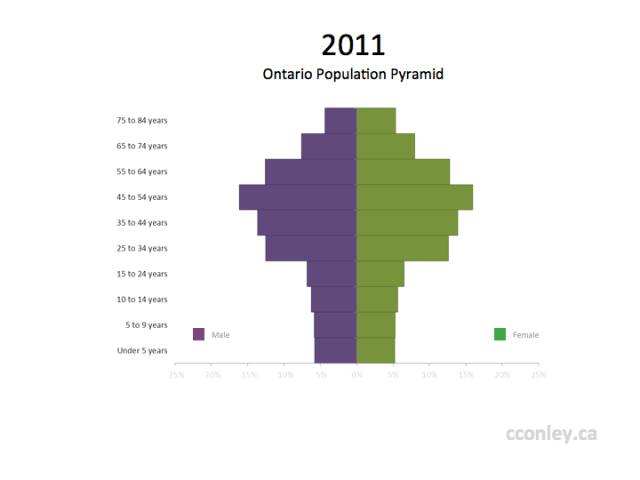
Statistics Canada has released the Age and Sex data set for 2011. A traditional visualization for this kind of data is the population pyramid. The population pyramid is a modified version of a stacked bar chart with the division between categories centered around 0. You may notice that this population pyramid for Ontario, using the 2011 census, looks more like a tree than a pyramid. One of the reasons for this is that the youngest categories have been divided into 5 year ranges whereas the adult ages are divided into 10 year ranges.

Source: Statistics Canada, 2011 Census of Population, Statistics Canada catalogue no. 98-311-XCB2011017 (Canada, Code01)
These ranges are historical categories that have been used to describe Canadian populations as far back as 1921.
Although the difference between age ranges accounts for the narrow neck of the pyramid, the thicker bands in the older age ranges provides a glimpse of the movement of the baby-boomers through the distribution. The impact of the baby-boomers on the population distribution becomes even more apparent when the historical data sets are presented as an animated time series:
An interactive population pyramid is also available from Statistics Canada that presents the data across smaller age ranges, giving a more detailed and refined view of the changes. Where the population pyramid at the beginning of this post was created using data reported by the Census, Statistics Canada’s interactive visualization uses data that is “extrapolated using the annual rates of population growth from the Population Estimates Program.”
