Light on the Knowledge, Heavy on the Mobilization

If you are looking for examples of effective knowledge mobilization, the health sector is a good place to start. Antismoking networks and organizations have become very effective at disseminating research findings in public messages that are accessible and memorable. The results of their efforts can be seen in the public policy changes that have expanded restrictions on smoking in workplaces and public spaces. While the work of these organizations provides insight into the knowledge mobilization process, Ross MacKenzie and Becky Freeman give us an interesting look at knowledge mobilization gone awry.

In the May 2010 issue of the Canadian Medical Association Journal, Ross MacKenzie and Becky Freeman shared the results of their investigation into a second-hand smoking statistic that was gradually embraced by both the antismoking advocacy groups and the public. The statistic in question stated that second-hand smoke is “23 times more toxic in a vehicle than in the home”. Ross and Becky were able to identify 19 articles that quote this statistic and found even more references to it in the media. With all of these citations over such a long period of time, what led Ross and Becky to question this statistic?

It turns out the devil really is in the details. While “conducting research for an Australian advocacy campaign to ban smoking in cars” Ross and Becky could find references to the statistic but could not find a “scientific source for this comparison”. No primary sources. In fact, a number of references offered no citation at all; the statistic was simply quoted as fact. How could this happen?

The first citation of this statistic is reportedly found in a 1998 newspaper article discussing legislation to ban smoking in cars. A politician was moved to introduce this legislation when she read it in a tobacco control advocacy group’s press-release, which cited a study in 1992. However, the 1992 study did not make the claim. It is unclear to me whether the statistic was misquoted or fabricated but what happened next is even more interesting. The “23 times more toxic” claim lay dormant for a few years and then resurfaced as a reference in a series of reports and articles published between 2003 and 2005. The claim again lay dormant for a few years and exploded in 2008 and 2009 in more reports and articles.

Ross and Becky include a network diagram in their article that describes the flow of the claim through organizational publications. In their visualization, each citation is listed in a box. Lines connecting the boxes describe the flow of citations from one report to another. Although the date of publication is included as a label in each box, it is not an organizing element. This may have served the purpose for Ross and Becky’s article but I think the timeline played a larger role in the evolution of myth to fact. Following are two visualizations that I have redesigned to include time as an organizing element.

In this first redesign of Ross and Becky’s diagram, the original reference (published in 1992) is at the centre of the visualization with annual rings radiating out and labeled with the works that perpetuate the false-claim.  (Click on the image for a larger view)

In this visualization only the years with publications restating the false-claim have been labeled and shaded. The years between these citations are smaller, unshaded and unlabeled. It is easy to see in this visualization that there are periods of “quiet” where the false-claim is not included in organizational material.  Unfortunately, the layout of this visualization discards the relationship between citations that were included in Ross and Becky’s diagram.

In this second redesign, the circular layout is exchanged for a modified hierarchical tree diagram. I have discarded the reference to the original publication (1992) and only included the first instances of the false-claim (1998). (Click on the image for a larger view)

 In this visualization bubbles are labeled with the name of organizations or publications that reference the false-claim. Each organization is connected according to their citations. In addition to being an unusual data set to use in a tree diagram, additional modifications have been made. These modifications include attributing years of publication as level attributes and columns that organize the relationships between publications according to their distance from the original citation (primary, secondary sources etc.). The thickness of each year varies (expands and contracts) according to the number of publications or organizations that reference the false claim. Years where the false claim is not referenced are thin and unshaded whereas years where there are multiple references (for example 2009) are shaded and much thicker. 

This visualization of data makes it possible to compare the position of articles and their “connectedness”. As bubbles move further to the right, they get “further away” from the original article (Rocky Mountain News) as a primary source. As bubbles move down the diagram, they recirculate the false claim and reintroduce it to peers and the public. For example, the Ontario Medical Association (OMA) Report revived the claim 6 years after the false claim was first published and appears to have been the most effective in the survival and persistence of the false-claim. Once included in the OMA report, the statistic was referenced in four other publications which further spawned four more citations.

The inclusion of the false-claim in a published form certainly increased its perceived credibility but in the intervening “quiet” years, researchers had the opportunity to question and challenge the statistic. Unchallenged, the false-claim emerged as a fact with its inclusion in additional publications and repeated citation by leaders and advocates. The publication of Ross and Becky’s work highlights the importance of knowledge mobilization and the extent to which it can have an impact on our lives. This is wonderful if the research is sound but serves as a warning that mistakes (whether innocent or malicious) do happen. It also highlights the researcher’s responsibility to continually challenge research findings regardless of how obvious or satisfying the results may be.

Posted in Data Visualization | Leave a comment

Education and Health Care – Using Slopegraphs to Understand Complex Systems

Both Education and Health Care are complex systems that impact everyone. Those who work in both of these systems dedicate a great deal of time to collect data to inform and support decision making. Unfortunately, data from a complex system is complex. Even more unfortunately, the easiest questions to ask are usually the hardest to address through data analysis. Are our schools better?  Are people healthier? Not to sound evasive but it depends on what you mean by “better” and “healthier”. “Better” to the parent of a kindergarten student may relate to how welcoming they feel the school is, how quickly their child’s reading skills develop and how much their child enjoys going to school. For the parent of a high school student it may be how well prepared they feel their child is to graduate or how well positioned they are for a job, College or University. Patients in emergency rooms will probably focus on the length of time it takes to see a physician while someone with questionable test results may reflect on how long it takes to see a specialist to determine whether something is wrong.

To understand these complex systems Leaders in these organizations rely upon a variety of indicators (data that provides feedback on the status or condition of an organization). At the Ministry of Education indicators are used to monitor and evaluate areas such as literacy, numeracy and student achievement. While these indicators summarize very large data sets, they are seldom abstract enough for relationships and patterns to be easily discernible. If, on average, we can only retain 7 to 9 chunks of information, it becomes an almost impossible task to perceive trends across 20 graphs of indicators which each contain 20 points of comparison. Clearly more consideration and work is required.

Last week I came across this post from Charlie Parks who highlighted the slopegraph; an infrequently used data visualization first proposed by Edward Tufte. To draw attention to the value of slopegraphs and encourage their use, Charlie reviewed some examples and invited people to forward more. His post was very persuasive and motivated me to look for a data set and explore how slopegraphs might be applied.

While researching the availability of community data sets I found a 2011 Report on Ontario’s Health System called the “Quality Monitor: Health Quality Ontario” (English report here and Regional analysis here).  This report was a collaboration between Health Quality Ontario and the Institute for Clinical Evaluative Sciences (ICES).  The analysis  included in this report is exhaustive and profiles 14 Local Health Integration Networks (LHIN) but does not provide the kind of higher level summary that slopegraphs could provide. After looking more closely at the data I realized that it would not be possible to create a slopegraph according to Tufte’s strict definition which requires a univariate timeseries for multiple categories or groups. Unfortunately, there are no historical data sets included in the Health data report.  Nevertheless, I think that the slopegraph could be just as meaningfully adapted to aggregated categorical data where there are explicit relationships between the categorical variables and a common scale. I also think the slopegraph would be more widely adopted if its definition was expanded to include other data types.

Caveat…

To that end, while I recognize the following graph is a modified slopegraph (or a parallel coordinate plot), I will refer to it as a “slopegraph” for ease of reference.

A little bit about the data…

The 2011 report from ICES addresses the complexity of the Health Care System by reducing it to 121 indicators which are reported for each of the 14 LHINs (the map of LHINs on the right can be found on page 119 of the report). Each of the 1,694 cells in the data table (pages 129 to 136 of the report) has been color coded to make it easier to perceive meaningful differences:

  • Light-Blue = LHIN-values that are higher than the provincial-values.
  • Light-Orange =  LHIN-values that are lower than provincial-values.
  • White = LHIN-values that are equivalent to provincial-values.

It is important to note that the criteria ICES uses for these comparisons vary according to the distribution of values and the direction of the indicators (see foot note on page118).  After a little data-entry, the following totals were calculated:

  • Total number of LHINs that are “Above Average” for each indicator.
  • Total number of LHINs that are “Below Average” for each indicator.
  • Total number of Indicators that are “Above Average” for each LHIN.
  • Total number of Indicators that are “Below Average” for each LHIN.

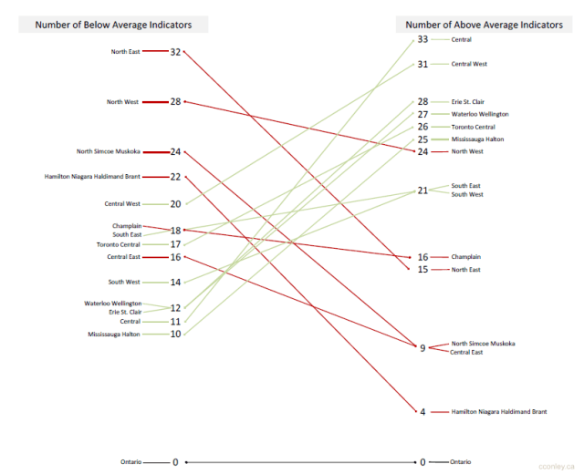
Using these summaries, a slopegraph was created to explore the differences between LHINs.

Reading a slopegraph…

As mentioned previously if this slopegraph conformed rigidly to Tufte’s definition, each the line connecting each vertical axis would describe change over time.  Instead, this slopegraph describes the difference between LHINs on two measures: the number of “Below Average” indicators and “Above Average” indicators.  Each measure is given its own axis which begins at 0 (bottom) and ends at 33 (top).  Although each axis uses the same scale the only labels that are included are those that represent LHIN-values.  For example, on the “Below Average” axis the Central East LHIN (this network includes the Durham Region) has a value of 16 (16 “Below Average” indicators in the Central East LHIN).  Since there is no LHIN that has a “Below Average” value of 15 (15 “Below Average” indicators), there are no labels or values printed at this position.  An advantage of this approach is how easy it becomes to see the distribution of values, th maximum and minimum values and how the data may be grouping or clustering across each distribution.

Two additional modifications to the slopegraph include the labelling of repeating values and the color coding of slopes. In Tufte’s example of a slopegraph, repeated values were stacked (for example the position of Canada and Belgium in 1970). However, by stacking the labels it gives the visual impression that one label is higher than the other. To address this I added tails to connect each label to its value on the axis. Where there are repeated values, the tails are diagonal and where there are single values, the tails are horizontal. One issue to consider regarding this modification is whether the tails add too much visual clutter or if (as intended) it makes it easier to distinguish the position of the labels relative to their values.

The line that connects the LHIN-values on each axis has been color coded to highlight the direction of the slope. Lines that increase from left-to-right represent LHINs that have more “Above Average” indicators than “Below Average”. To highlight this positive slope the line has been shaded green. On the other hand, lines that decrease from left-to-right represent LHINs that have more “Below Average” indicators than “Above Average” and have been drawn in red.  Since provincial values were used to determine whether indicators are above or below average, the province has been included to anchor the graph and serve as a visual point of reference for the other values.


Of all the interesting patterns and differences that emerged from this data set, the one that caught my attention was the location of the slope for the Central East LHIN. If you were asked to find a LHIN that is most representative of the province (fewest “Above Average” indicators and fewest “Below Average” indicators), Central East would be the line to choose.  While other LHINs have smaller values on one axis, there are no others that have values that are as small on both measures.  For example, although the Hamilton Niagara Haldimand Brant LHIN has fewer “Above Average” indicators (4)  it has significantly more indicators that are “Below Average” (22).

To find that the Central East LHIN is closest to the provincial slope is not surprising.  The Durham Region regularly mirrors provincial averages and change over time for a wide variety of indicators from other sectors. In fact, the Durham Region is very similar in terms of geography where the south very urban and the north is rural.  This geographic distribution also translates into similar socio-demographic distributions. For those market researchers out there, all roads may lead to Rome but all data sets appear to lead to the Durham Region as an incredibly consistent provincial microcosm.

Final thoughts on slopegraphs…

Rather than restricting slopegraphs to univariate timeseries data, I think it should be more generally defined by its key characteristics such axiis with common scales, explicit relationships between the plotted variables and minimal data-ink.  However, if this is taking too much license with the definition of a slopegraph perhaps there could be a taxonomy of slopegraphs with this one classified as a Categorical-Slopegraph?

Additional trivia from the data set…

Each of the indicators that were included in the ICES analysis could be further aggregated into one of 18 groups.  However, there is little consistency in the number of indicators that comprise each group. For example:

  • “Accessible 2.3 Surgical Wait Times and Access to Specialists” is comprised of 24 indicators.
  • “Integrated 8.1 Discharge/ transitions” is comprised of 20 indicators.
  • “Safe 4.3 Mortality in hospital” is comprised of 1 indicator.
  • “Accessible 2.2 Access to Primary Care” is comprised of 2 indicators.

There were very few instances of missing data (No Value) but data for two indicators was missing for the majority of LHINs:

  • “Accessible 2.3 Surgical Wait Times and Access to Specialists – knee replacements” (No Value for 11 of 14 LHINs)
  • “Accessible 2.3 Surgical Wait Times and Access to Specialists  – Cataract surgeries” (No Value for 9 of 14 LHINs)

Proportionally, the indicator groups with the highest (most “Above Average” indicators) and lowest (most “Below Average Indicators”) percentages for the province were:

  • Above Average: Accessible 2.3 Surgical Wait Times and Access to Specialists
  • Below Average: Safe 4.3 Mortality in hospital


Posted in Data Visualization | Tagged , , , , | 1 Comment

5 More Tools for the Researcher Without a Budget

During the final rush of the school year I came across a few more tools and resources that have become regulars in my toolkit.  I hope you will find them as useful as I have.

Zotero: http://www.zotero.org/
Level of difficulty: 3 out of 10

Zotero is a Firefox plug-in that offers point-and-click captures of book and journal citations. Zotero goes the extra mile by letting you manage your citations with folders and tags and also provides an option to generate bibliographies in a variety of formats (APA, AMA, ASA, Chicago Manual, Vancouver, etc.). Although this Firefox plugin resides in your browser you always have access to your saved citations regardless of your access to the internet.

Text Mining Tool:http://text-mining-tool.com/
Level of difficulty: 3 out of 10

Text Mining Tool is a small utility that will convert a variety of formats (pdf, doc, rtf, chm, html) into straight text. If you have ever had problems navigating pdf formatting the Text Mining Tool (windows only) is a quick solution to getting to the text. It is even more powerful when combined with PDFUnlock (mentioned here).

timeanddate: http://www.timeanddate.com/worldclock/meeting.html
Level of difficulty: 1 out of 10

If you need to schedule a meeting with someone from another time zone, this online application generates a table with visual cues for the most convenient meeting times.

Opinion Lexicon:
http://www.cs.uic.edu/~liub/FBS/sentiment-analysis.html
Level of difficulty: 1 out of 10

When analyzing qualitative data from attitudinal surveys, developing a library of key words and phrases for coding can be time consuming. The Opinion Lexicon is an ongoing compilation of “positive and negative opinion words or sentiment words for English (around 6800 words)” and was initially developed as part of a paper by Minqing Hu and Bing Liu. Professor Bing Liu of the University of Illinois at Chicago’s Department of Computer Science has continued to update the lexicon as part of his exploration of sentiment analysis and subjectivity.


WhattheFont: 

http://new.myfonts.com/WhatTheFont/
Level of difficulty: 1 out of 10

The website MyFonts offers a nice online utility that will help identify fonts that are used in documents. All you need to do is capture an image of the font you are interested in, uploade the picture and WhattheFont will tell you the font name. This is an online utility that I didn’t realize I needed until I started using it.

Posted in Productivity, Research Resources, Tech Tips | Tagged , | 1 Comment

CSSE 2011: Research Tweets From the East Coast

To explore the tweets from the Canadian Society for the Study of Education (CSSE) 2011 conference I turned again to the twitteR package for R. My initial plan had been to compile the tweets at the end of CSSE, which seemed like a good approach given my experience with the #AERA11 tweets (see “End of an AERA” for the summary of my first twitter extract). Unfortunately I encountered two challenges: 1) CSSE participants were more active than the AERA participants and 2) Twitter only provides access to a maximum of 1500 tweets. These two issues meant that my first compilation did not go back far enough to include tweets from the first day of the conference.

Fortunately, the MStanoeva had the foresight to create a twitter archive (using Twapper Keeper) to capture all of the tweets directed to #Congress11. Using this archive, I was able to locate and obtain the 200 tweets I had missed due to my poor timing. The lesson here is to schedule more frequent extracts rather than trying to anticipate the patterns of activity. While some people are very persistent and conscientious in their use of twitter (for example retro-tweeting: taking notes offline and then tweeting them when wi-fi is available) most people only tweet when wi-fi is easily accessible. Like the AERA compilation, if anyone is interested in the tweets for CSSE 2011, I am more than happy to share it upon request.

Overview

Over the 5 days of CSSE (May 28 to June 1) there were 1,733 tweets to #Congress11 with most of the tweets being shared on Monday (447) and Tuesday (440). The top five contributors were @awatson8381 (95), @ColetteB (85), @Researchimpact (73), @Caitlinkealey (59) and @SSHRC_CRSH (50).

Of all the tweets that were sent during CSSE, 73 were retweets (tweets that included the text “RT”). The user @Fedcan was retweeted the most (11)  followed by @researchimpact (6), @FredTourism (5) and @ITNurse (5). Although advertisements and promotionals had the highest frequency of retweets, the research finding that captured the most attention was from @firstnationbook’s tweet that

“First Nation’s youth are more likely to go to jail than graduate high school”.

The majority of the 353 tweets that shared a website link used Bit.ly (162 tweets) followed by t.co (38), yfrog.com (32), ow.ly (22) and twitpic.com (18). The links that were most frequently shared were:

    Finally, there were 29 different twitter clients that were used by CSSE registrants with the majority of tweets submitted from twitter (732), tweetdeck (286), blackberry (200), hootsuite (63) and echofon (57).

Although CSSE was from May 28th to June 1, the larger Congress continued until June 4.  Over these additional 3 days Congress participants continued to be incredibly active on twitter. Thank you to everyone who attended CSSE for the opportunity  share in the experience from a distance.

Posted in Research Resources | Tagged , , , , | Leave a comment

The Juggler’s approach to project management

Over the past few years multi-tasking has been revealed as a myth in the context of project management and productivity.  It may be possible to combine a physical task with a cognitive task (think chewing gum, walking down the street and talking on the phone) but as more cognitive tasks are added, multi-tasking becomes less feasible. Could you simultaneously develop a sampling framework, an inventory of data collection tools and an overview of analysis for three different projects?

You may choose to work on a sampling framework for project A, then B and then C, but that is switch-tasking, not multi-tasking. An advantage of switch-tasking is that you will always be prepared to say that you are moving forward with your responsibilities when you are asked for an update. Unfortunately, by switching attention and focus between different tasks there is an increased risk that a critical detail may be overlooked.

Juggling is fun to watch, a challenge to master and commonly used as a metaphor in project management. You might think jugglers are multi-taskers because they keep a group of objects moving in complex patterns, but take a closer look. How many of those objects (balls, bowling pins, flaming torches) do they hold? At any given time a juggler’s hand is only ever in contact with one object.  As soon as that object is thrown into the air, the juggler’s hand (and attention) moves to the next object.

Does that mean that jugglers are experts at switch-tasking? Consider what happens when someone taps the juggler on the shoulder and asks for help carrying equipment (or someone asks you take on a new project with a higher priority). The objects do not magically freeze and float in the air until the juggler returns. Instead, they are set aside and left until the next opportunity to pick them up. The momentum is lost and regaining that momentum requires more time and energy.

Instead, jugglers are masters of serial-tasking. They place their full attention and focus on the patterns they are creating (the task) to impress the audience. By focusing on their task and seeing it through to the end, the juggler is better prepared to maintain their momentum and quickly regain it if they “drop the ball”. Like the juggler, when your time is protected so that you can direct your full attention and focus on a task to its completion, you are better equipped to account for all the details and quickly deal with the dropped balls. Where multi-tasking is a myth, switch-tasking is an exercise in frustration as your attention gets redirected with changing priorities and emergencies.  It’s during the switching of tasks that details get overlooked and balls are dropped.  Serial-tasking guards against this by focusing on a task to its completion before switching to the next high priority task.

Posted in Productivity | Tagged , , , | Leave a comment